We’re taking a look at what’s trending in the web design world and pulling out a few key elements to keep in mind when designing your next website. Overall, minimalism is in, but what does that mean?
We see this minimalism theme repeated throughout the design world – from the use of color to logo design to the font choice. So what are some ways you can focus on bringing minimalism into your designs without being plain or boring?
We’ve outlined some key elements that will help drive this theme home in a way that intrigues your customers and clients.
Website
What’s the primary goal of a website (besides sales)? Guiding the user’s eyes and giving them the information they need to understand what it is you do. Minimalist design is an easy way to ensure this happens. Too much clutter, movement, or elements are distracting to the user and will confuse them. If you do that, they will leave your site.
Here are a few ways to intentionally bring minimalist design the pages on your site:
- White Space: Take advantage of white space! Well, first, what is it? White space refers to the unused space around the elements on your website. It helps separate text, graphics, or photos and makes your pages look less crowded. AND it doesn’t have to be white!

- Menu Navigation: It’s essential to have an easy to navigate menu at the top of your website, so your user doesn’t spend a lot of time searching for what they need. Challenge yourself to only have 4-5 main menu items in your headers, and take advantage of sub-navigation! Another critical element to a successful menu is using one-worded menu titles.

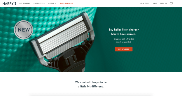
- Images: Using large imagery with minimal text is a simple way to attract users without overwhelming them visually. Use a nice clean font that is easy to read, and add an overlay to your image that allows your font to stand out. Alternating sections of white space and pictures create a visual aesthetic that is pleasing for your customers to scroll through.

Color
Choosing the right colors is essential to the success of any design, but you must be mindful of adding it in without overloading your future customers. Too much or too little will result in your website visitors to be bored or give them a headache!
- Monochromatic: This is a fun way to base your website in one color while still having enough variety to keep it interesting. Let’s use blue as an example; you can use navy as an excellent base color and add in different shades to create a range from dark to light throughout your website.

- Color Pops: Try basing your design in black or another dark color, and use pops of bright colors to draw the user to a specific area.
- Don’t like dark colors? Try combining bright colors with neutrals instead!

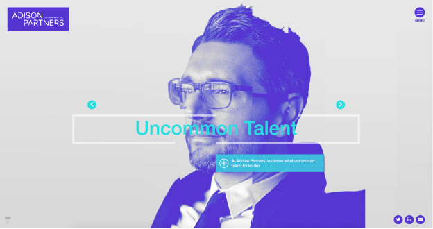
- Colored Overlays: Have a picture that seems a little blah? A colored overlay can help bring life to that image and draw the viewer to look at it. It’s important not to overdo this treatment; remember, minimalism is in!

Fonts
A great way to draw your users to read and take in what’s essential about your business is font choice! Large, bold headers and clean minimal supporting text create a balance that is easy on the eye. Keep it minimal, and only choose 2-3 fonts to use throughout your site. Too many font choices are distracting and creates discrepancies within your brand.
Here are a few font styles that are fun ways to incorporate design into your copy instead of having text slapped on a page.
- Beveled or chiseled effects
- Hand lettering and brush strokes
- Serifs and round san-serifs
- Don’t be afraid to combine these two font styles!

Graphics
When adding in graphic elements on your site it’s essential you remember not to go overboard. Highlight key information within a section with a nice set of icons, but don’t have them in every section through the website. Overdoing it on the graphics is distracting, and they’ll quickly lose their purpose!
- Simple hand-drawn icons are a great way to draw the user to read a statistic or fact about your business. Try combining an icon with a short sentence about your services for an interesting way to get the viewer to learn more about your business. The simpler, the better, when it comes to icons! Nice clean icons will always do the trick.
- Try using thin lines or separators to break up sections on your site.

For now, that was a quick look at some 2020 web design trends. There’s so much more that we’d love to cover and will do so in a later blog. If you incorporate just a few of the suggestions here, your website will see a huge improvement in user experience. If you have any questions about web design, doesn’t hesitate to contact us. We’d love to help!


